Pantone’s Color of the Year: A Cautious Approach to Furniture and Interior Design
Pantone’s Color of the Year: A Cautious Approach to Furniture and Interior Design
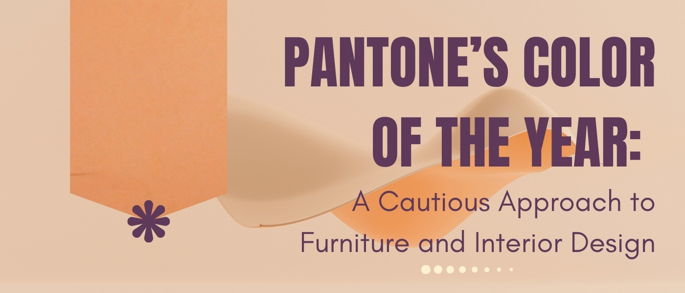
Each year, the design world eagerly anticipates Pantone’s announcement of its Color of the Year, a hue that captures the zeitgeist and influences trends across various industries. In 2024, Pantone introduced “Peach Fuzz,” a soft, warm shade intended to evoke feelings of comfort and connection. While such colors can inspire creativity, incorporating them into furniture and interior design requires a thoughtful approach.
The Allure and Challenges of Trendy Colors
Pantone’s Color of the Year often resonates with current cultural moods, offering a fresh palette for designers. However, these colors are typically bold or unique, making them more suitable for accents rather than dominant themes. For instance, while “Peach Fuzz” brings warmth, using it extensively on large furniture pieces can overwhelm a space and limit future design flexibility.
Moreover, trendy colors can quickly become dated. Investing heavily in such hues for permanent fixtures may lead to a need for costly updates as trends evolve. Therefore, it’s essential to balance current trends with timeless design principles.
Strategic Incorporation of Trend Colors
To embrace Pantone’s Color of the Year without compromising longevity, consider the following strategies:
• Accent Pieces: Introduce the color through smaller items like throw pillows, rugs, or artwork. This allows for easy updates as trends change.
• Complementary Palettes: Pair the trendy color with neutral tones to create a balanced look. For “Peach Fuzz,” combining it with whites, creams, or soft grays can enhance its warmth without overpowering the space.
• Textiles and Accessories: Use the color in fabrics and accessories, which are easier to replace than large furniture pieces. This approach offers flexibility and keeps the design fresh.
Zuo Modern’s Perspective
At Zuo Modern, we recognize the importance of staying current while ensuring our products remain versatile and enduring. Our designs often incorporate trendy colors in subtle ways, allowing customers to enjoy contemporary aesthetics without sacrificing timeless appeal. By focusing on quality materials and adaptable designs, we provide furniture that complements various styles and stands the test of time.
Conclusion
While Pantone’s Color of the Year offers exciting opportunities for innovation in interior design, it’s crucial to approach its integration thoughtfully. By using such colors strategically—primarily through accents and accessories—you can keep your space both trendy and timeless. Explore Zuo Modern’s collections to find pieces that harmoniously blend current trends with classic design.
Explore our collection and experience the Zuo Modern difference at www.zuomod.com.
About Zuo Modern
Zuo Modern is a global brand offering a full range of stylish, affordable furniture for residential, office, and hospitality spaces. Known for its fast shipping, broad inventory, and design-forward collections, Zuo supports industry professionals with tools that make sourcing simple and dependable.
Email us at hello@zuomod.com with any questions.
Or give us a call at 510-877-4087 (Mon–Fri: 5:00 AM–5:00 PM PT)
-
Why the U.S. Market Struggles with High-End Plastic Chairs (and What We Can Learn from Europe)
 June 25, 2025
 -
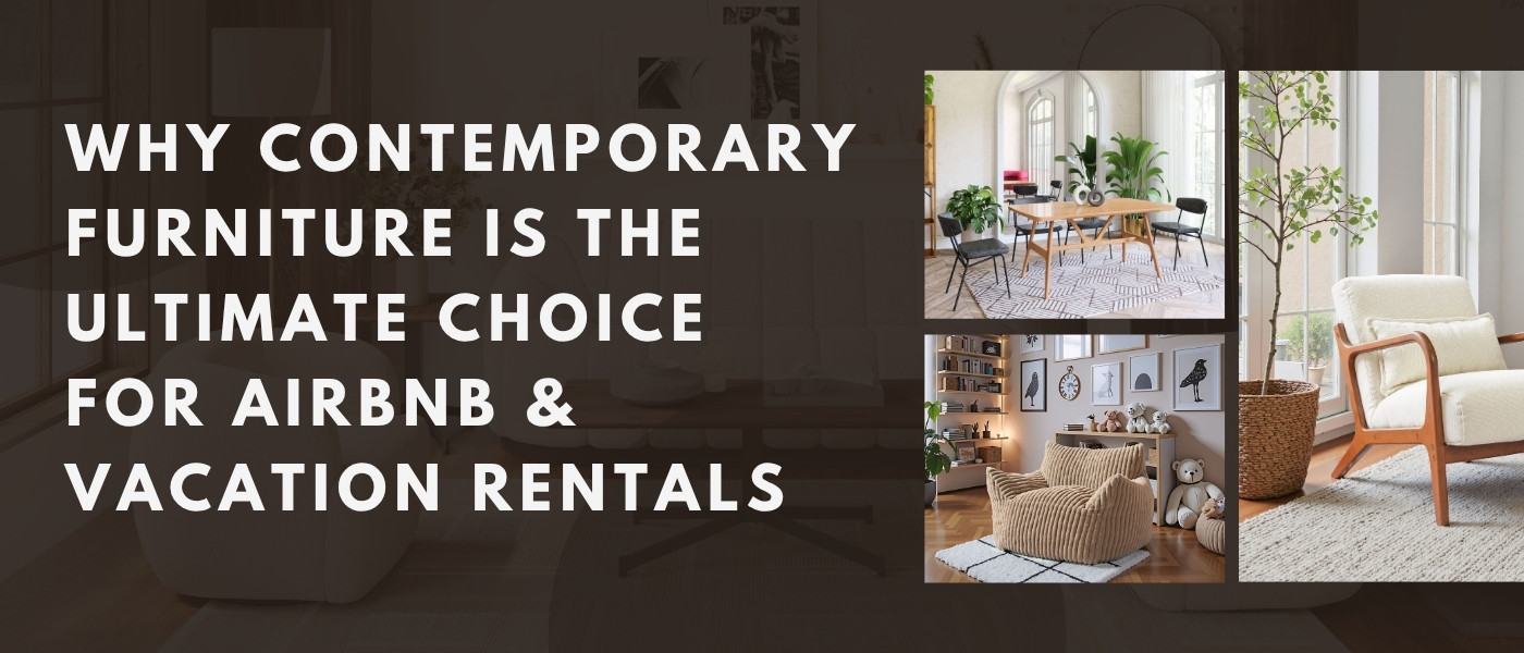
Why Contemporary Furniture is the Ultimate Choice for Airbnb & Vacation Rentals
 June 23, 2025
 -
Why Live Customer Service & Local Sales Reps Matter More Than Ever in Furniture - Especially for Hospitality Projects
 June 18, 2025
 -
Why Trade Shows Matter More Than Ever In an Age of AI Content and Virtual Worlds
 June 16, 2025